What is Responsive Design?
Responsive design is a web design approach that ensures your website adapts and looks perfect on all devices — whether it’s a desktop, laptop, tablet, or smartphone. Instead of creating separate versions for each device, a responsive website automatically adjusts its layout, images, and text to fit the screen size.
In simple words, responsive design makes your website mobile-friendly and ensures visitors have a great experience no matter how they access it.
What is Website Responsiveness
Fluid Grids
Fluid grids are a fundamental aspect of responsive design. They use relative units like percentages, rather than absolute units like pixels, for page element sizing. This flexibility allows the layout to adjust fluidly across different screen sizes and resolutions.
Flexible Images
Images in responsive design are scalable, often through CSS, ensuring that they do not exceed their containing element. This scaling is crucial for maintaining layout integrity and ensuring that images contribute positively to the user experience on any device.
Media Queries
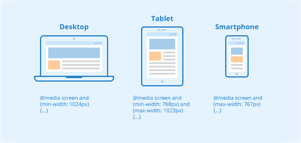
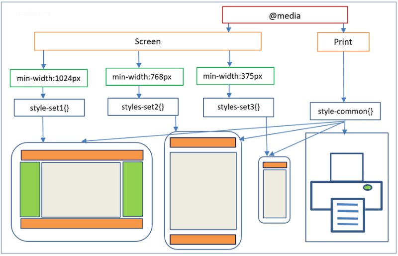
Media queries allow designers to apply different styles based on the characteristics of the device displaying the content, such as its width, resolution, or orientation. This conditional use of CSS rules ensures that a website can adapt its layout and functionality to suit any viewing context.
Media Queries Examples
All size media queries
/*
Extra small devices (phones, 600px and down) */
@media only screen and (max-width: 600px)
{…}/* Small devices (portrait tablets and large phones, 600px and up)
*/
@media only screen and (min-width: 600px) {…}
/* Medium devices (landscape tablets, 768px and up) */
@media only screen and (min-width: 768px) {…}
/* Large devices (laptops/desktops, 992px and up)
*/
@media only screen and (min-width: 992px) {…}
/* Extra large devices (large
laptops and desktops,
1200px and up) */
@media only screen and (min-width: 1200px) {…}
🌟 Why Use Responsive Design?
✅ Better User Experience – Visitors can navigate your site easily without zooming or scrolling excessively.
✅ Improved SEO Ranking – Google prioritizes mobile-friendly websites, which means responsive design boosts your search rankings.
✅ Cost-Effective – One website works on all devices — no need to build multiple versions.
✅ Increases Conversions – A smooth browsing experience keeps users engaged and more likely to take action (buy, sign up, or contact you).
✅ Future-Proof – As new devices come out, your site will continue to adapt.
The Importance of Responsive Design
Responsive design is critical in today’s internet usage context for several reasons:
Enhanced User Experience
Responsive websites provide a seamless experience across devices, improving user satisfaction and engagement.
Improved SEO Ranking
Google prioritizes mobile-friendly websites in its search results. Responsiveness is a key factor in SEO strategy.
Cost-Effectiveness
Maintaining one responsive website is less costly and time-consuming than managing separate sites for mobile and desktop.
Higher Conversion Rates
A responsive design can lead to higher conversion rates as it improves usability and satisfaction among users.
Responsive Design in Action: A Sample Overview
To understand responsive design better, let’s consider a hypothetical website for a local café. This website features:
A Fluid Grid Layout
The layout adjusts so that content is displayed in a single column on mobile devices, two columns on tablets, and three columns on desktops, ensuring readability and ease of navigation.
Flexible Images
Images of the café and its offerings adjust in size without distorting their aspect ratio, ensuring they look good on any screen.
Media Queries
The website uses media queries to change the navigation menu’s appearance—transforming from a horizontal layout on desktops to a drop-down menu on smaller devices.
This responsive approach ensures that whether a user is browsing on a smartphone while on the go, or on a desktop at home, the website is always accessible, legible, and engaging.