Freelance Responsive Website Design Services – Build Mobile-Friendly, SEO-Optimized Websites
Looking for freelance responsive website design services that make your business stand out online? You’ve come to the right place. In today’s digital-first world, a responsive website isn’t just a trend — it’s a necessity. Whether your customers browse from a phone, tablet, or desktop, your website must look perfect and perform smoothly on every device. That’s exactly what professional freelance web design services deliver.Hiring a freelancer for responsive web design gives you the flexibility, creativity, and affordability needed to create a website that’s both visually stunning and functionally efficient. A skilled freelance web designer can develop a custom website that adapts to all screen sizes, ensuring your visitors get a seamless browsing experience.Why Freelance Responsive Website Design Services Are Essential
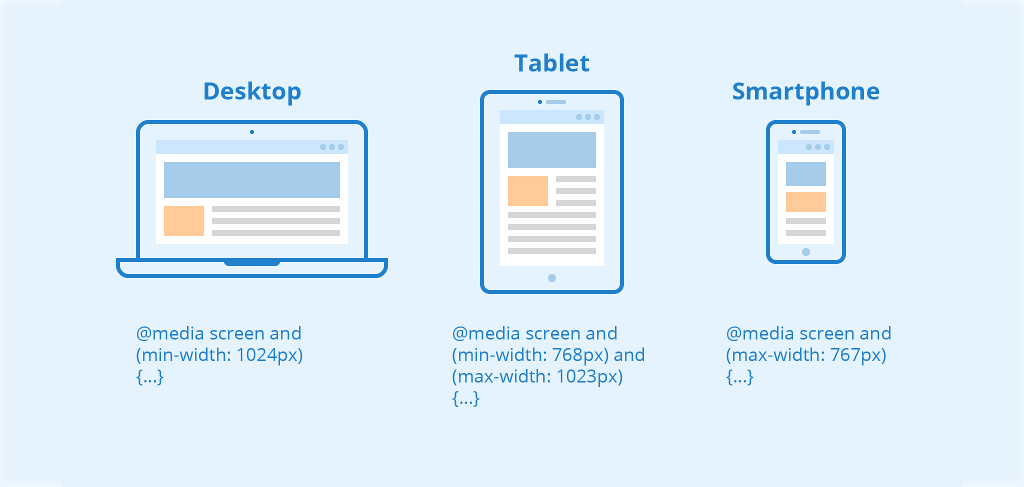
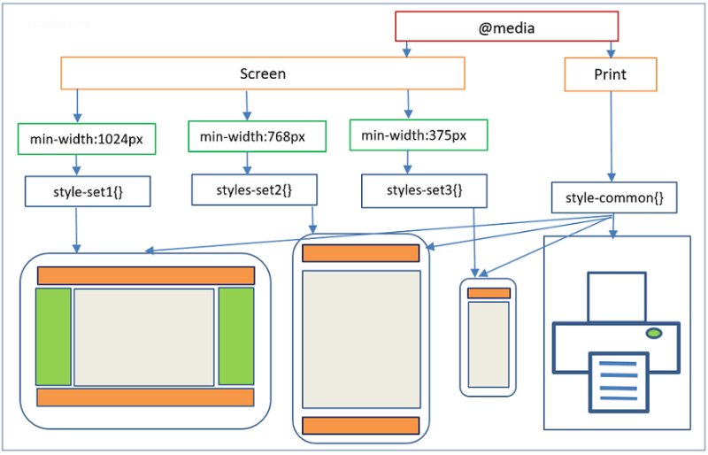
A responsive website automatically adjusts its layout and content to match any device’s screen size. This means no more pinching or zooming — your users get the best viewing experience no matter where they are. Businesses that invest in freelance responsive website design services enjoy better SEO rankings, higher engagement rates, and improved conversions.Benefits of Choosing Freelance Responsive Website Design Services
- Mobile Optimization: More than 70% of web traffic comes from mobile devices — responsive design ensures compatibility.
- Improved User Experience: Consistent layout and fast loading across all screens keep visitors engaged.
- Better SEO Results: Google rewards mobile-friendly websites with higher rankings.
- Cost Efficiency: A single responsive website eliminates the need for separate desktop and mobile versions.
- Faster Development: Freelancers work directly with clients, ensuring faster communication and delivery.
What Do Freelance Responsive Website Design Services Include?
When you hire a freelance responsive web designer, you gain access to a full suite of web design services that cover everything from planning to launch — all tailored to your brand’s identity and business goals.1. Custom Responsive Web Design
A freelancer creates a fully customized website that represents your brand perfectly. Using clean layouts, flexible grids, and optimized images, your site will look professional and consistent across all devices.2. WordPress and CMS-Based Websites
Freelancers specialize in creating mobile-friendly WordPress websites. These platforms allow easy management, fast loading, and SEO integration without technical headaches.3. E-Commerce Responsive Design
Sell your products online with ease. A freelance responsive website design expert can create a mobile-optimized eCommerce store that ensures a smooth shopping experience for customers.4. UI/UX Design
Freelancers focus on user-centered designs. They ensure navigation, layout, and visual hierarchy are intuitive, keeping visitors on your site longer.5. Landing Page Design
Need a page for promotions or lead generation? Freelance designers build responsive landing pages that load fast and drive conversions on all devices.6. Website Redesign Services
Already have a website but it’s outdated or not mobile-friendly? Freelancers can redesign it to meet modern web standards, improving performance and SEO visibility.7. Maintenance and Optimization
Professional freelancers also offer ongoing support — including updates, performance checks, and mobile responsiveness tests to keep your website performing at its best.Technologies Used in Freelance Responsive Website Design Services
Freelancers use a variety of modern tools and frameworks to deliver fully responsive and high-performing websites:- Frontend: HTML5, CSS3, JavaScript, Bootstrap, Tailwind
- Backend: PHP, NodeJS, MySQL
- CMS: WordPress, Shopify, OpenCart, Wix
- Design Tools: Figma, Adobe XD, Photoshop, Illustrator
Why Hire a Freelancer for Responsive Website Design?
Working with a freelancer offers advantages that big agencies often can’t match. You get direct communication, faster turnaround, and affordable pricing — all with a personal touch.Freelance vs Agency Web Design
| Feature | Freelance Web Designer | Web Design Agency |
|---|---|---|
| Cost | Affordable and flexible | Expensive fixed pricing |
| Communication | Direct with designer | Through project managers |
| Delivery Speed | Quick turnaround | Slower process |
| Customization | Fully personalized | Template-based design |
| Support | Dedicated after-project care | Limited and often extra cost |
SEO Benefits of Freelance Responsive Website Design Services
When you invest in freelance responsive website design services, you’re not only improving user experience but also enhancing your website’s SEO performance. Google prioritizes mobile-friendly sites, and responsive design is a key ranking factor.- Faster load times improve SEO and user satisfaction.
- Single URL structure simplifies content management and indexing.
- Reduced bounce rates due to optimized layouts.
- Better accessibility and usability on all devices.
- Clean, SEO-friendly HTML structure with optimized meta tags and headings.
How to Hire Freelance Responsive Web Design Experts
Hiring the right freelancer for your project requires clarity and communication. Here’s how to get started:
- Define Your Goals: Know what you want — a new website, redesign, or landing page.
- Review Portfolios: Check the freelancer’s previous work for design quality and responsiveness.
- Discuss Requirements: Share your content, features, and preferred styles.
- Agree on Timeline and Budget: Set clear milestones and deadlines.
- Stay Involved: Provide feedback during the design process to ensure satisfaction.
Cost of Freelance Responsive Website Design Services
The cost varies based on your website type and complexity. On average, here’s what you can expect to pay:
- Basic Responsive Website: $300 – $600
- Business Website: $600 – $1,000
- E-Commerce Website: $800 – $2,000+
- Landing Page Design: $150 – $400
Freelancers usually offer flexible pricing and milestone-based payments, making their services accessible for startups and small businesses.
Frequently Asked Questions (FAQ)
Q1. What is a responsive website?
A responsive website automatically adjusts its layout and elements to fit any screen size, providing an optimal viewing experience for users.
Q2. Why should I hire a freelancer for responsive web design?
Freelancers offer personalized attention, flexibility, and affordable rates while delivering professional-quality design and functionality.
Q3. Can a responsive website improve my SEO?
Yes. Google favors mobile-friendly websites, and a responsive design improves rankings, user experience, and site performance.
Q4. How long does it take to build a responsive website?
Typically, 7–10 days for small websites and 3–5 weeks for larger, complex projects.
Q5. Do freelancers offer post-launch support?
Yes. Most freelancers provide maintenance, security updates, and website optimization even after the site is launched.
Conclusion: Choose the Best Freelance Responsive Website Design Services
In the age of smartphones and mobile browsing, investing in freelance responsive website design services is one of the best decisions for your business. A professional freelancer will help you create a website that looks stunning, performs flawlessly, and ranks well in search engines — all without breaking your budget.
Whether you need a business website, eCommerce store, or portfolio site, hiring a freelance designer ensures you get a modern, responsive, and SEO-friendly website built to engage visitors and grow your brand online. Start today and experience the power of responsive web design for your business success.
Are you looking for a Freelance Web Design and Development Expert who can turn your vision into a functional, visually appealing, and high-performing website? In today’s digital age, a powerful website is essential for every business. Whether you’re a startup, entrepreneur, or established brand, working with an experienced freelance professional gives you access to creative, affordable, and customized solutions that meet your goals.
A freelance web expert combines creative design with robust development, ensuring your website not only looks great but also performs efficiently. From user-friendly layouts to SEO optimization and mobile responsiveness, hiring a freelance web design and development expert can help you build a website that drives engagement and business growth.
Why Hire a Freelance Web Design and Development Expert?
Hiring a freelance web design and development expert gives you the flexibility and personalized service that agencies often can’t match. Freelancers work independently, managing each project with full attention to detail, creativity, and client satisfaction.
Benefits of Working with a Freelance Web Design and Development Expert
- Cost-Effective: Save money while getting professional-quality web design and development.
- Direct Communication: Collaborate directly with the expert handling your project.
- Tailored Solutions: Every design is customized to reflect your brand and business goals.
- Fast Turnaround: Freelancers deliver projects efficiently without unnecessary delays.
- Creative Freedom: Expect unique, modern, and engaging designs tailored to your audience.
Services Offered by a Freelance Web Design and Development Expert
A professional freelancer offers complete web solutions — from design to development and ongoing support. Below are some key services you can expect:
1. Custom Website Design
Get a personalized website that perfectly aligns with your brand’s identity. A freelance web design and development expert focuses on user experience, intuitive navigation, and appealing visuals.
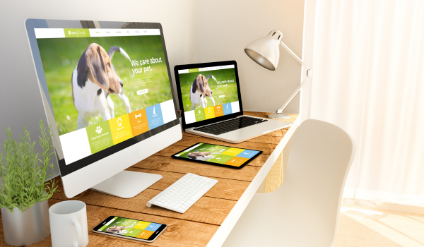
2. Responsive Website Development
Modern websites must look and perform well on all devices. Freelancers create fully responsive websites that adapt seamlessly across mobile, tablet, and desktop screens.
3. WordPress Website Development
WordPress is a leading CMS platform that offers flexibility and ease of use. Freelancers develop custom themes, plugins, and layouts tailored to your business needs.
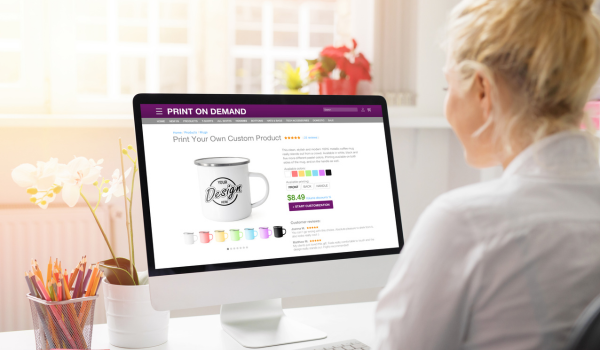
4. E-Commerce Web Development
Looking to sell products or services online? A freelance web design and development expert can build secure, fast, and conversion-optimized eCommerce websites with platforms like WooCommerce or Shopify.
5. Front-End and Back-End Development
Freelancers handle both the design (front-end) and functionality (back-end) aspects of your website. This ensures consistent performance and seamless integration of features.
6. SEO and Performance Optimization
Professional freelancers design and code websites with SEO best practices in mind — including fast loading, optimized images, clean code, and structured meta data to help you rank higher in search results.
7. Website Maintenance and Support
After your site goes live, your freelance web expert provides regular updates, backups, and technical support to ensure smooth performance and security.
Technologies Used by Freelance Web Design and Development Experts
Freelancers stay updated with the latest tools and technologies to build high-quality, efficient websites. Common technologies include:
- Frontend: HTML5, CSS3, JavaScript, Bootstrap, ReactJS, VueJS
- Backend: PHP, NodeJS, MySQL, MongoDB
- CMS Platforms: WordPress, Shopify, OpenCart, Wix
- Design Tools: Adobe XD, Figma, Photoshop, Illustrator
By combining design and development expertise, freelancers ensure your website is both beautiful and technically robust.
Freelance Web Design and Development Process
Working with a freelance web design and development expert involves a structured process to ensure transparency, efficiency, and client satisfaction:
- Discovery & Consultation: Understanding your business, goals, and target audience.
- Design Phase: Creating wireframes, mockups, and prototypes for approval.
- Development: Coding the front-end and back-end for full functionality.
- Testing & Quality Assurance: Ensuring performance, security, and responsiveness.
- Launch & Support: Going live and providing post-launch maintenance.
Freelancer vs Web Agency – Which Is Better?
Choosing between a freelancer and an agency can be tough, but for most small and medium businesses, hiring a freelance web design and development expert is the better choice. Here’s why:
| Feature | Freelancer | Web Agency |
|---|---|---|
| Cost | Affordable and flexible | Expensive fixed pricing |
| Communication | Direct and personal | Through project managers |
| Flexibility | Highly adaptable | Limited customization |
| Turnaround Time | Faster and focused | Slower due to multiple teams |
| Support | Personalized and ongoing | Often charged separately |
SEO Advantages of Working with a Freelance Web Design and Development Expert
SEO plays a vital role in ensuring your website reaches the right audience. A skilled freelancer integrates SEO into every stage of design and development:
- Clean and structured HTML for better indexing
- Optimized images and fast-loading pages
- Mobile-first responsive layouts
- Proper use of meta tags and headings (H1–H4)
- Integration of SEO tools and analytics
How to Choose the Right Freelance Web Design and Development Expert
Follow these simple steps to find the perfect freelancer for your project:
- Check their portfolio and past work quality.
- Read client testimonials and ratings.
- Discuss project requirements, timeline, and budget clearly.
- Ensure they have experience in both design and development.
- Ask about post-launch support and maintenance services.
Cost of Hiring a Freelance Web Design and Development Expert
Pricing depends on your project’s size, features, and complexity. Below is a general estimate:
- Basic Business Website: $300 – $600
- Corporate or CMS Website: $600 – $1,200
- E-Commerce Website: $1,000 – $2,500+
- Web Application or Custom Development: $2,000 – $5,000+
Freelancers often offer flexible payment structures, such as hourly rates or milestone-based payments, to suit different project needs.
Frequently Asked Questions (FAQ)
Q1. What does a freelance web design and development expert do?
They design, develop, and maintain websites that combine aesthetic appeal with technical functionality to help your business grow online.
Q2. How long does it take to create a website?
Depending on the complexity, a basic website may take 7–10 days, while larger projects can take 3–6 weeks.
Q3. Can a freelancer handle both design and development?
Yes. A freelance expert typically manages both design and coding, ensuring seamless coordination and quality control.
Q4. Will my website be SEO-friendly?
Absolutely. Freelancers design with SEO best practices to help your site rank better in search engines.
Q5. Do freelancers provide post-launch maintenance?
Yes, most freelancers offer support packages for updates, security, and performance monitoring.
Conclusion: Hire a Freelance Web Design and Development Expert for Your Business
Hiring a Freelance Web Design and Development Expert is one of the smartest investments for any business looking to establish or improve its online presence. With expertise in both design aesthetics and technical development, freelancers deliver complete, cost-effective, and scalable web solutions tailored to your goals.
Whether you need a small business website, an online store, or a complex web application, a freelance expert ensures high-quality results, faster delivery, and ongoing support. Take your brand to the next level — hire a professional freelance web design and development expert today!
Hire a Web Developer Freelancer
You can easily hire me from trusted freelancer platforms. Below are my official hiring links:
Each link will take you to my verified freelancer profile where you can view client feedback, past projects, ratings, and directly hire me for your web development needs.
Contact & Hire
You can contact or hire me directly using the links below or reach out via WhatsApp and email.
Street Number 5, Sadhu Nagar, Mohan Nagar, Dera Bassi, Punjab 140507
- 📱 WhatsApp: +91 9888967231
- 🌐 Website: balrampartapsingh.com
- 📧 Email: balrampartapsingh@gmail.com
- 💼 Upwork: Upwork Profile
- 🎯 Fiverr: Fiverr Profile
- 🧭 Guru: Guru Profile
- Front End Development Website Developer
- Local WordPress Developer
- Avada Professional WordPress Theme Customization
- Why Every Business Needs a Professional Website
- Hire a Freelancer for Website Design and Developer
- Customize Flatsome Theme and WooCommerce According to Your Requirements
- Freelancer for Website Design and Development
- Avada Custom Branding Professional WordPress Development Services
- Avada Custom Branding CSS Services – Balram Partap Singh
- Website Development Freelancer Near Me – Hire Top Indian Freelancer
- Hire a Professional Local WordPress Developer
- Avada Custom Header Development
- Web Design Services Near Me
- Best Website Developers Near Me
- Hire Top Freelancer Web Developer
- Freelance WordPress Developers India
- Chandigarh WordPress Website Builder – Professional Web Design Services
- Australian WordPress Website Builder
- Freelance Website Designer
- Freelance Web Developer
- Professional Freelance Website Designer
- Hire Freelance Website Designer Online
- Freelance Responsive Website Design Services
- Freelance Web Design and Development Expert
- Freelance WordPress Website Designer
- Creative Freelance Website Designer Worldwide
- Remote Web Designer for Hire