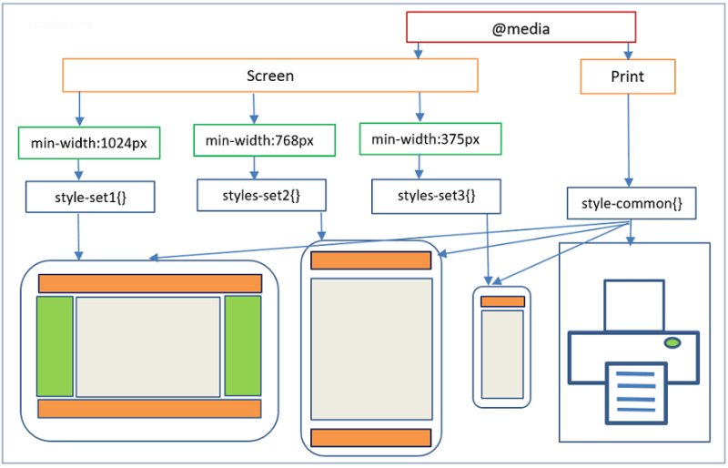
A computer, tablet, and smartphone displaying the same website in different layouts, illustrating website responsiveness.
A computer, tablet, and smartphone displaying the same website in different layouts, illustrating website responsiveness.